before i get to my card, i want to thank those of you who left kind and comforting words on my last post of the card i made in memory of my son. pushing myself to create keeps me going and i appreciate your taking the time to offer your compassion and support.
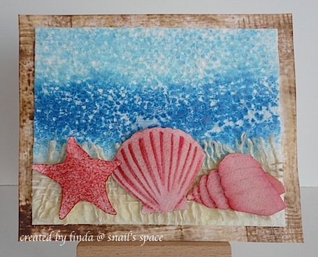
the ranger ink seasonal colour palette challenge looked so challenging that i just had to play along. my fondest summer memories are going to the beach and cottage when i was much much younger. i coloured the shells with a brush and distress ink pads in aged mahogany and pumice stone, but stamped the starfish with aged mahogany and cut them all out; i popped them on foam tape on a piece of mesh ribbon. i used a paper towel for the water and sky by soaking up adirondack stonewashed and denim blue inks and i used walnut stain and antique linen DI to create the frame, which i brushed and used direct to paper technique. thanks for popping by.

Ooh . . . something quite different here Linda. Thanks for explaining the background techniques. Love the addition of the mesh ribbon.
Hugs
Sarn xxx
Wow! You really took on this challenge in a big way Linda. Love the results. Have a wonderful weekend my friend!
:)
Awesome! The impressionistic look is cool, and the colours go well together. It’s a cute ocean scene.
Beautiful, your design looks like it should be hanging in a ‘beach home’ :) Have a great weekend, Shirleyx
Oh my, this is so lovely. And thanks for explaining how you did the background. I am learning so many new techniques lately (if I can just remember them!). What a grand idea for the paper toweling, it made wonderful water texture. Your pretty shells were so effective against your ‘sand ribbon’. I had to re-read to figure out what the sand was. A beautiful card, and I hope you are feeling a bit better today. Many hugs.
This is a wonderful card. I too am working on seaside themes and just love this theme.
Your shells look great and really are eye catching!
Stunning card Linda!
Love
Maarit